S.E.E.D.
Empowering the future of business
What you will come across
- Brief intro into the project
- My role & responsibilities (being a super hero :p )
- A dig into the design approach - Design Process
- End user's and audience
- Visually organizing information - Mind Mapping
- Website Metrix
- Brainstorming activity for plugins - WordPress
- Design bible as I call it - Style Guide
- First step into design through low fidelity diagrams
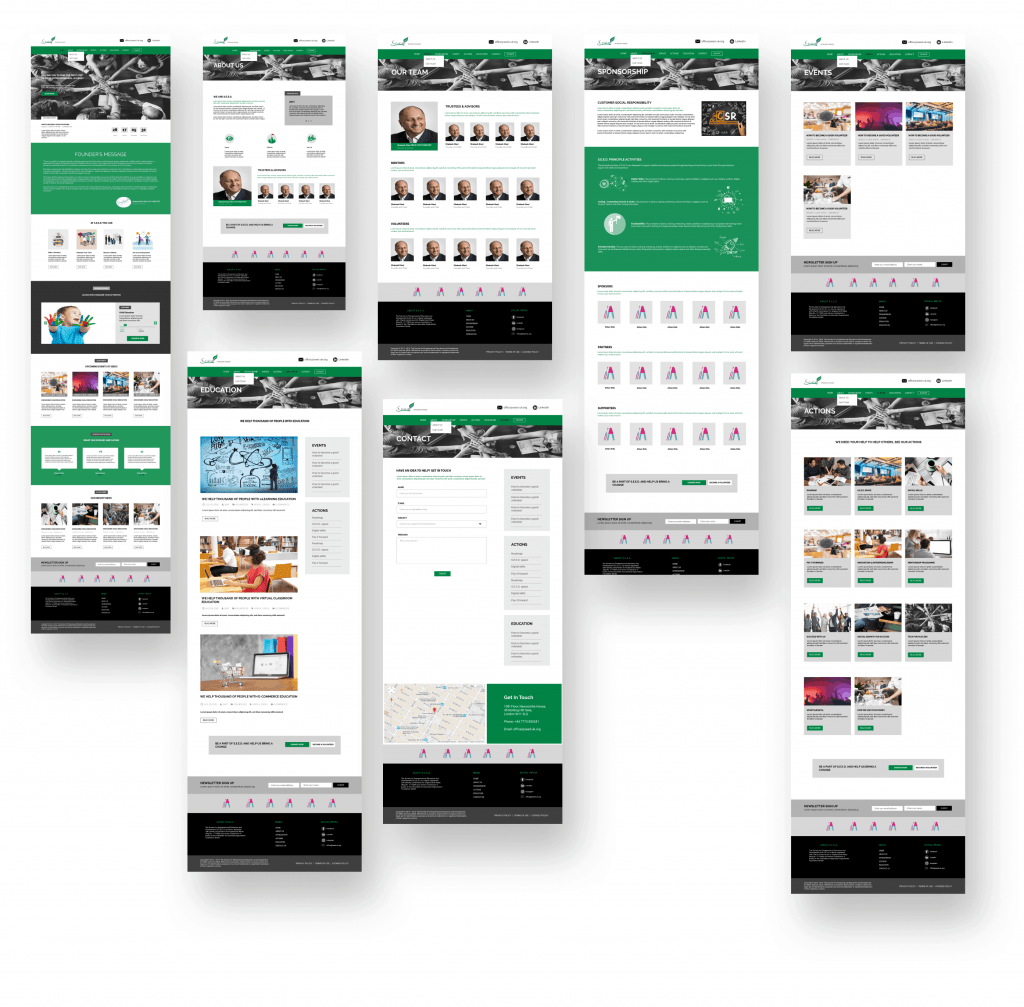
- A look at high fidelity wireframes
- Responsive design
Roles & Responsibilities
I lead both the design and development side of the project. Took it as a challenge and an opportunity at the same time to understand the strategies, processes involved with startups. What I learnt from working with startups is you have to put on a magic hat where you should be able to pull out things as desired as you always have to step ahead your scope of work.
- Website
- UX/UI Development (WordPress)
- Product Design
- Project Management
- Planning & Strategy
About the project
The Society for Entrepreneurial Education and Development (S.E.E.D.) is a charity that delivers the right education, mentoring, and work experiences for any entrepreneur with an innovative, social impact business idea to advance our society.
Challenge
Being a charity website there is always so much information to display, keeping the website clean and simple with an efficient UX was always a challenge. Along with it, time constraint was also a point of concern. Also, myself being the only Product Designer and Developer leading the way, with very limited resources had to manage accordingly.
The project was to be developed in wordpress using free resources or very little extra budget to put in, which made it even more challenging as it bought along some constraints to the design part as well because limited UI variations were possible.
Scope
The project started from scratch where aim was to design and develop a charity website with multiple functionalities including handling donations, registering volunteers/mentors, displaying events, en-lighting much about what charity does with a clean UX. To overcome the challenges the project was planned in three phases.
– Starting with a Minimum Viable Product (MVP) where least required information was put on the website for people to know about the organization, also ask if any queries.
– Second phase included structuring the website to look more like a final product with almost all the information except the core functionalities like accepting donations, registering for events.
– Last and third phase, adding the missing functionalities.
Design Process
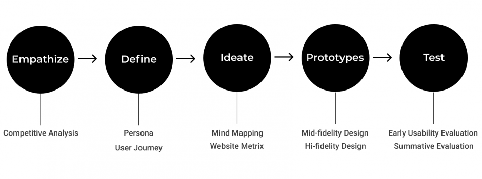
I used design thinking approach for this specific project. The process was carried in a complete agile manner where re-visiting and iterations were part and parcel. In addition to it, strategizing and planning were like a daily capsule as we always tried to stay a step ahead. I consider design thinking as the backbone of a UX process and is really close to me as a UX professional.

User's & Audience
Being a charity looking after early stage entrepreneurs, S.E.E.D. targets a diverse range of audience.
Senior professionals willing to join as mentors to help startups grow
Entrepreneurs looking for help with their startups
Volunteers interested in joining S.E.E.D.
Donors who wish to make online donations for a particular cause
People looking to books specific S.E.E.D. events
All the users are considered to have atleast some experience with computers
Mind mapping
“A problem well stated is a problem half solved”
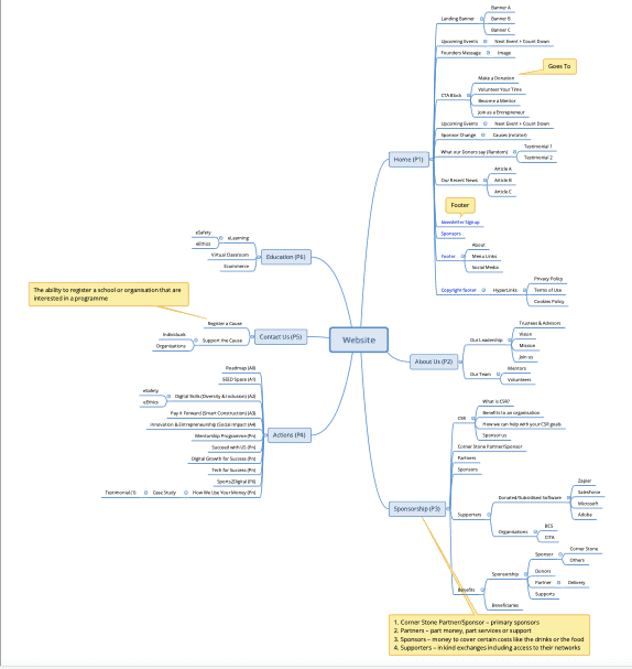
A mindmap was used as a concept enrichment method. Strong emphasis were laid upon mind mapping as it helped in generating new ideas and in identifying relationships among different sets of data and information.
*Due to client privacy & confidentiality agreement had to blur out the content
Website metrix
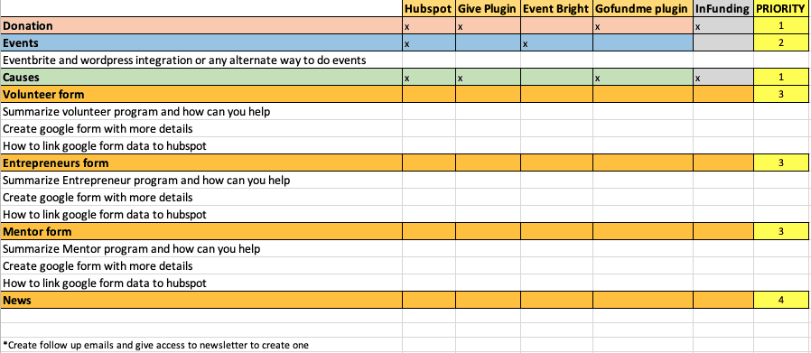
Website metrix proved really helpful as a pit stop between different phases. While iterating or moving ahead to the next phase, planning out the features priority along with if the execution plan was agreed upon, metrix spreadsheet was super helpful. Saved us time to move back and forth onto the options available with us.
Plugins
Tools are always most important part of any execution and when you are developing on wordpress selection of plugins plays a very important part to your efficiency of the website because wrong set of plugins could slower down your website and also worst part being conflicting with other plugins which might even crash down your website. Decisions into deciding set of tools was done keeping in mind future support request which should be easy to handle.
The website is developed in wordpress using Elementor page builder. Free version of elementor was used for MVP and after that pro version was used which helped to get rid of some of the plugins as Elementor pro is a powerful tool and takes care of lot of features. The table below was part of planning before proceeding to phase 2 of development.
S.No | Used for | Plugin | Remove with Pro |
1. | Hubspot integration (can use either) | 1. Hubspot All-in-One Marketing 2. WP Fusion |
|
2. | Events (can use either) | 1. Display Eventbrite Events in WordPress 2. Import Eventbrite Events |
|
3. | Causes (can use either) | 1. Give – Donation Plugin & Fundraising Platform 2. Crowdfunding for Easy Digital Downloads |
|
4. | Donations | Gofundme |
|
5. | Page Builder | Elementor |
|
6. | Custom fonts | Custom Fonts |
|
7. | Ecommerce | WooCommerce |
|
8. | Contact form (can use either) | 1. Contact form 7 2. Everest forms | X |
9. | Maintenance Mode | WP Maintenance Mode | X |
10. | Sliders (can use either) | 1. Smart Slider 3 2. Revolution Slider | X |
11. | PDF flipbook | 3D Flipbook : Dflip Lite |
|
12. | Import, Export, Backup | All-in-One WP Migration |
|
13. | Google Analytics | MonsterInsights |
|
14. | Custom preloader | Preloader Plus |
|
15. | SEO | Yoast SEO |
|
16. | Newsletter Popup | Popup Maker | X |
17. | Captcha | Really simple CAPTCHA |
|
18. | Theme | Ocean Extra |
|
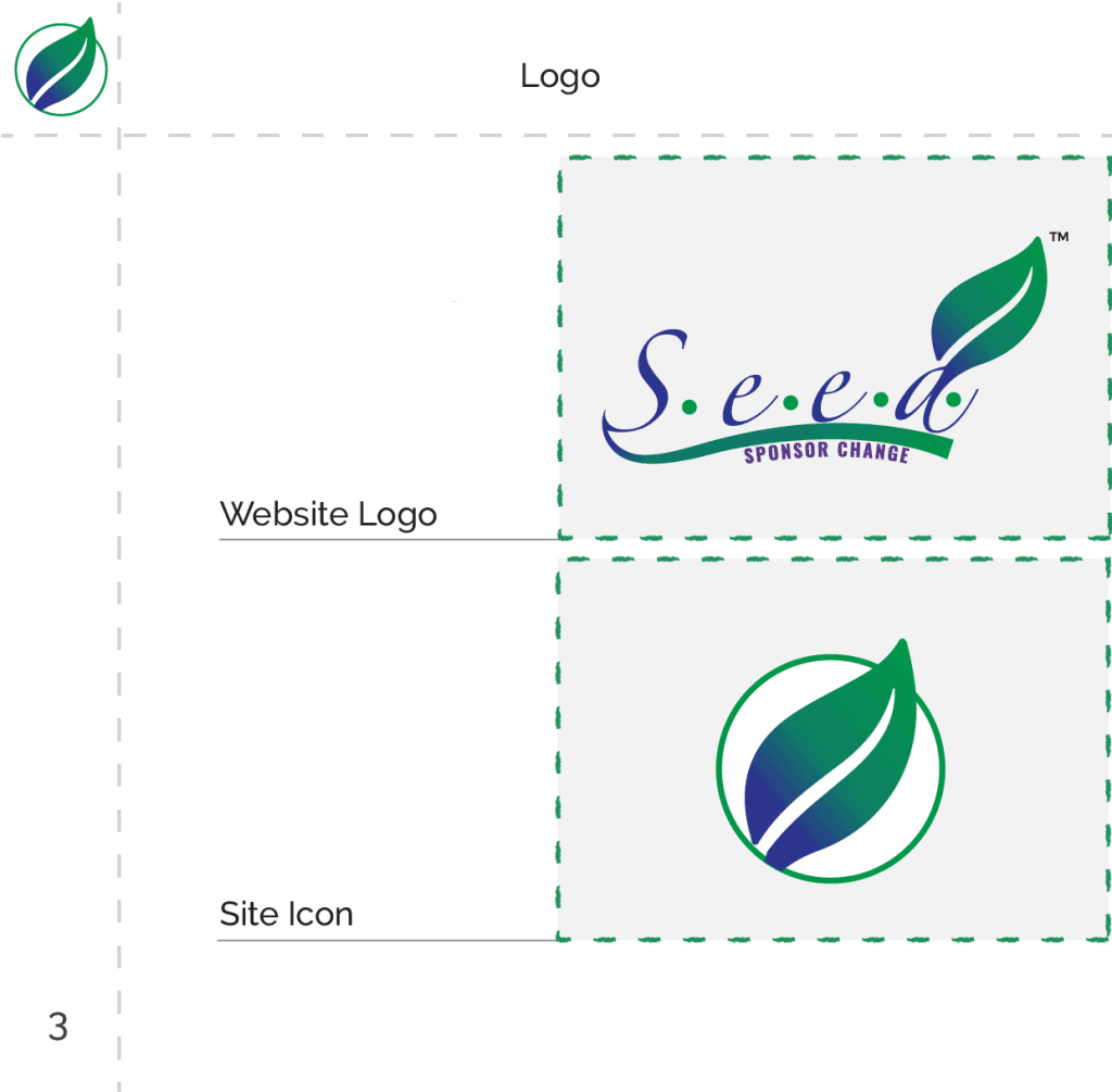
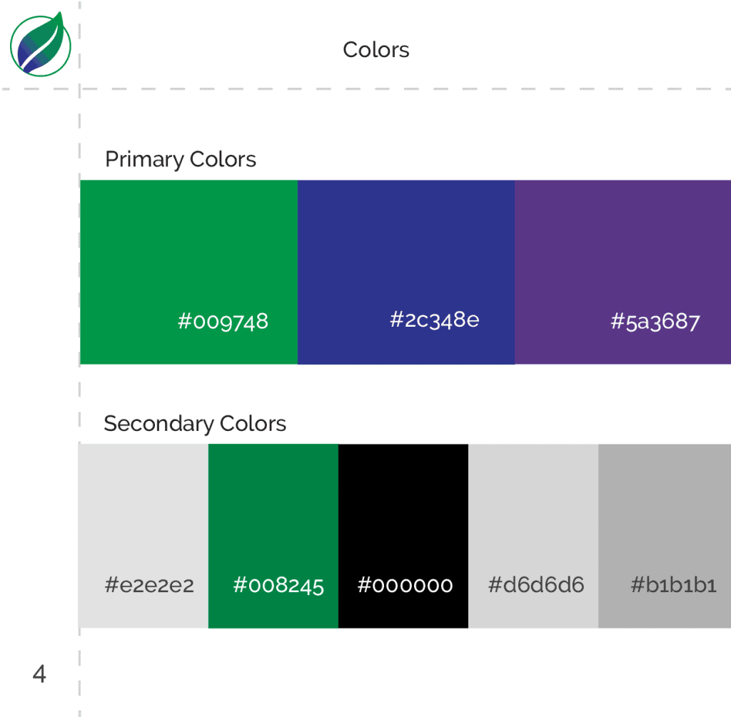
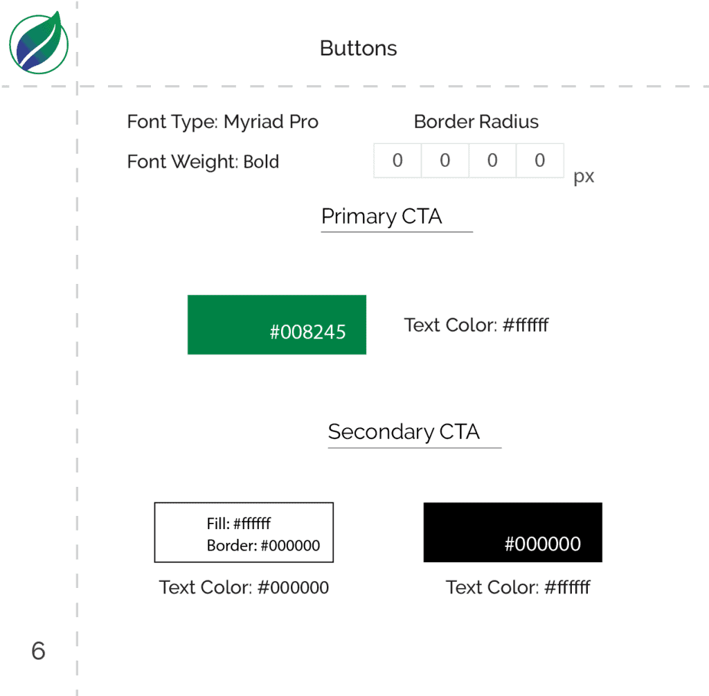
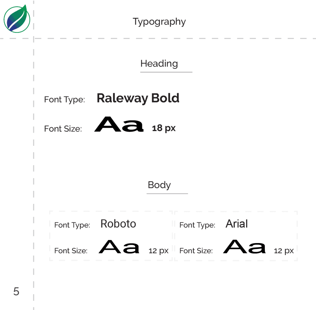
Style guide
A style guide was also produced for visual consistency. Major elements of the design were included into the guide.
Lo-fidelity diagrams
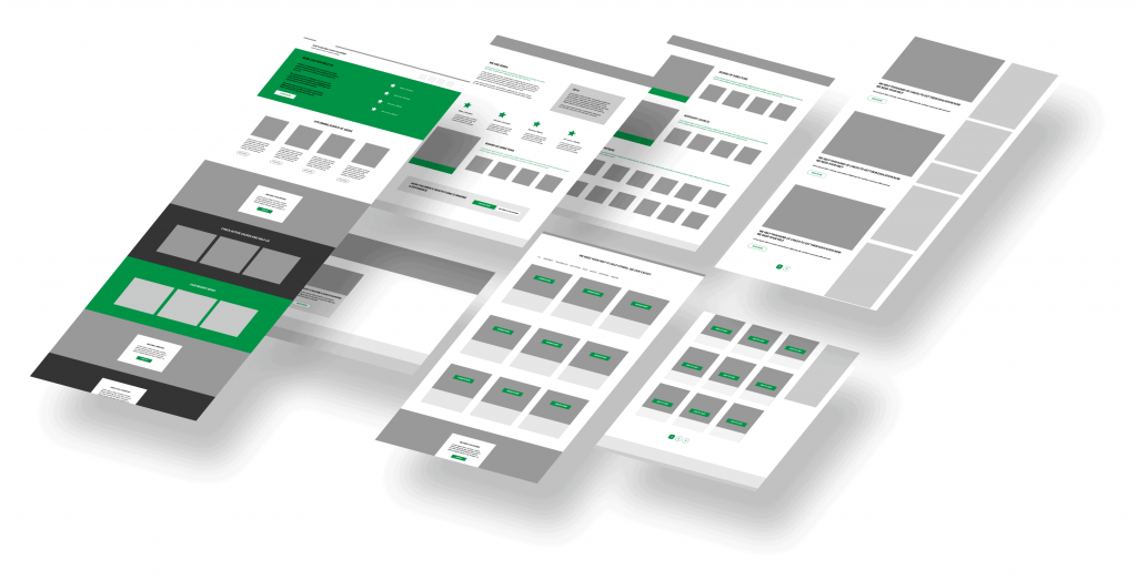
Even before doing an MVP, low fidelity wireframes comprising all the main functionalities were produced which formed the basic structure of the product though iterations were part and parcel of the product. The designs started with pencil paper to Lo-fi/mid-fi. Though the final product wasn’t an exact replica of the designs initially produced as there were many modifications/iterations in between but not much changed apart from restructuring the website a bit.

