E-commerce Checkout Flow
Aimed to achieve higher conversion rate
What you will come across
- Brief intro into the project
- My role & responsibilities (being a super hero :p )
- How do industry average rates compare to our product?
- A dig into the project approach - Design Thinking
- How people actually feel about e-commerce checkout - Online Surveys
- 2 profiles from our end users - Personas
- A capture of user journey
- First step into design through low fidelity wireframes
- A look at high fidelity wireframes
- Some insights after performing A/B eye tracking
- A walkthrough of the final product - Prototype Video
- Still not sufficient? A detailed case study flip book
Roles & Responsibilities
I lead the UX/UI design side of the project. Took it as a challenge and an opportunity to deeply understand the e-commerce industry. Post completion of the design, handed over the project to developers.
- Website
- UX/UI Design
- UX Research
About the project
Uzma bozai is a women specific brand selling high end designer products online.
Challenge
An ecommerce platform doesn’t just want users to explore their products but also to purchase them which is a conversion for them but the act of encouraging customers to buy a product is a task in itself. When looked into the stats through google analytics, end users were visiting and spending decent time but were not making a conversion.
My main aim was to improve the UX in-order to achieve a higher/improved conversion rate.
Key outcome
Through research, usability evaluation, re-design, A/B eye tracking and then implementation of some of those practice in real-life project, conversion improved from existing 0.17% to 0.98% in 2 months time.
Capture of some stats
Before jumping into the research and to understand how the website is actually doing, a quick capture of average rates was made and then the numbers were compared to industry average rates. The comparison of numbers showed a great scope of improvement. Google analytics was used to gather these details.
65.61%
Bounce rate
04:29 mins
Avg. checkout time
0.17%
Coversion rate
10.78%
Return rate

Design Thinking approach
I used design thinking approach for this specific project as it being an end to end process, helped me to deeply understand e-commerce checkout itself and how users behave when on a similar platform. I consider design thinking as the backbone of a UX process and is really close to me as a UX professional.
User survey's
Online surveys were conducted to empathize with the users and understand how they behave under certain specific scenarios. The scenarios revolved around checkout itself. I was trying to capture some broader insights which users at times tend to skip unless asked about. These scenarios were an outcome of literature review. A total of 83 participants participated in this survey.
61.4%
Do you prefer to sign-in or checkout as a guest user?
When asked about their preference of checkout, 61.4% of participants said they prefer to login to their account on checkout because the inputs from previous purchases are saved already and saves them time & efforts.
57.8%
What is your intension behind putting products to cart?
More than 50% of participants indented to purchase the products moved to cart. The next 44.6% of participants put products to cart just to confirm the final price, if there are any added costs like delivery with little to no intensions of purchase.
38.1%
What are your reasons behind abandoning the cart?
Majority of the participants gave reasons related to price shown on the catalog page to the final purchasing price. Very small percentages of other reasons included UX, delivery, distractions.
72.3%
Do you often leave the checkout page just before payment to look for other products?
A huge chunk of participants mentioned they sometimes followed this practice with 9.6% confirming they always do it.
47%
What is your reason to re-visit an e-commerce website?
Almost 50% of the participants think UX and products both play an equal part in returning to the platform and if one of them is missing, they prefer to move to some other platform.
User personas
2 primary personas were considered for this project. Uzma Bozai being a women tailored brand, few of specific emphasis are mentioned below:
Atleast working knowledge of computer
A male purchasing a product for his better half or a female friend
A girl shopping for herself
Target audience 18+
User has a taste for designer products
- Looking for an easy to use website

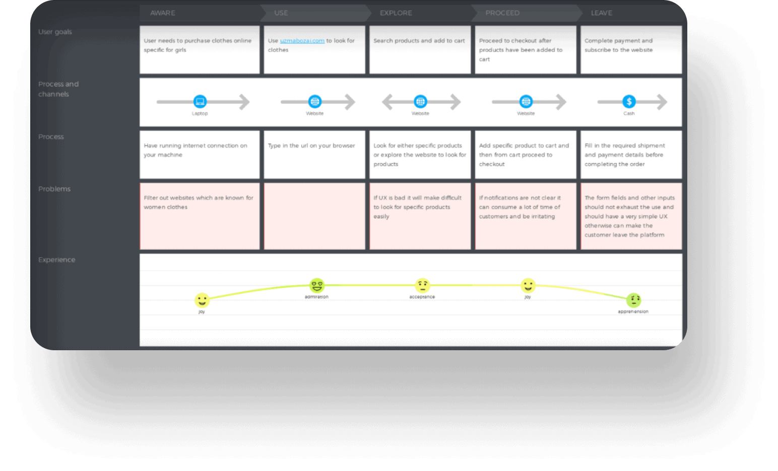
User journey
To get an understanding of users experience on the platform with a defined scenario user journey was helpful. Channels, user goals, process, problems, experience formed part of the user journey map in this case. (Want to get a clear picture of the UX journey? It’s just a click away :p)
Lo-fidelity wireframes
After gathering important information through research, did first piece of low fidelity wireframes. Some early usability evaluation was conducted on these low-fidelity wireframes before working on high fidelity wireframes.


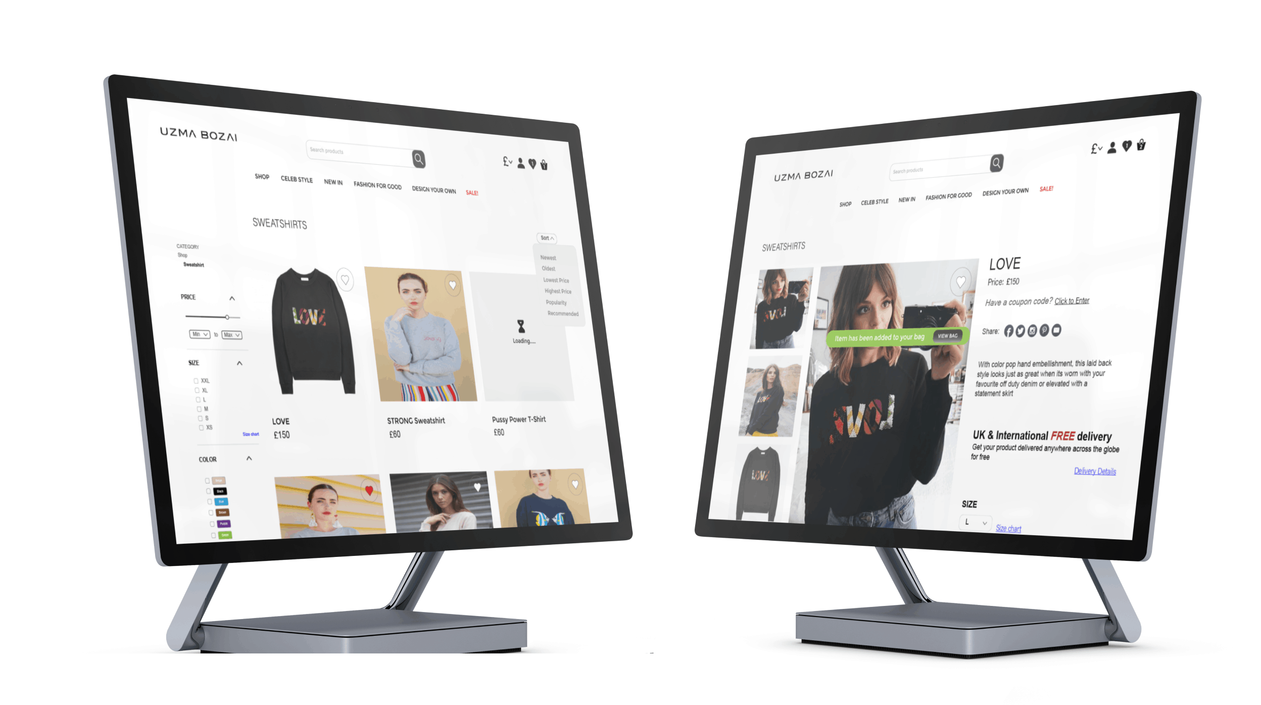
Hi-fidelity wireframes
With some feedback from early low-fidelity designs, I moved to the second stage where high-fidelity designs could be accomplished. The designs that were produced were more efficient which was confirmed from the A/B eye tracking. The wireframes were only confined to the checkout flow of the store rather than the complete product
As it is said first impression is the last impression, it holds true for e-commerce industry as well. Home page needs to be clear with it's aim and should also make easy for users to navigate around the website
When it comes to shop page, it should provide ways for users to filter out specific products they are looking for. Feedback like adding a product to wishlist or a cart should also be prominent.
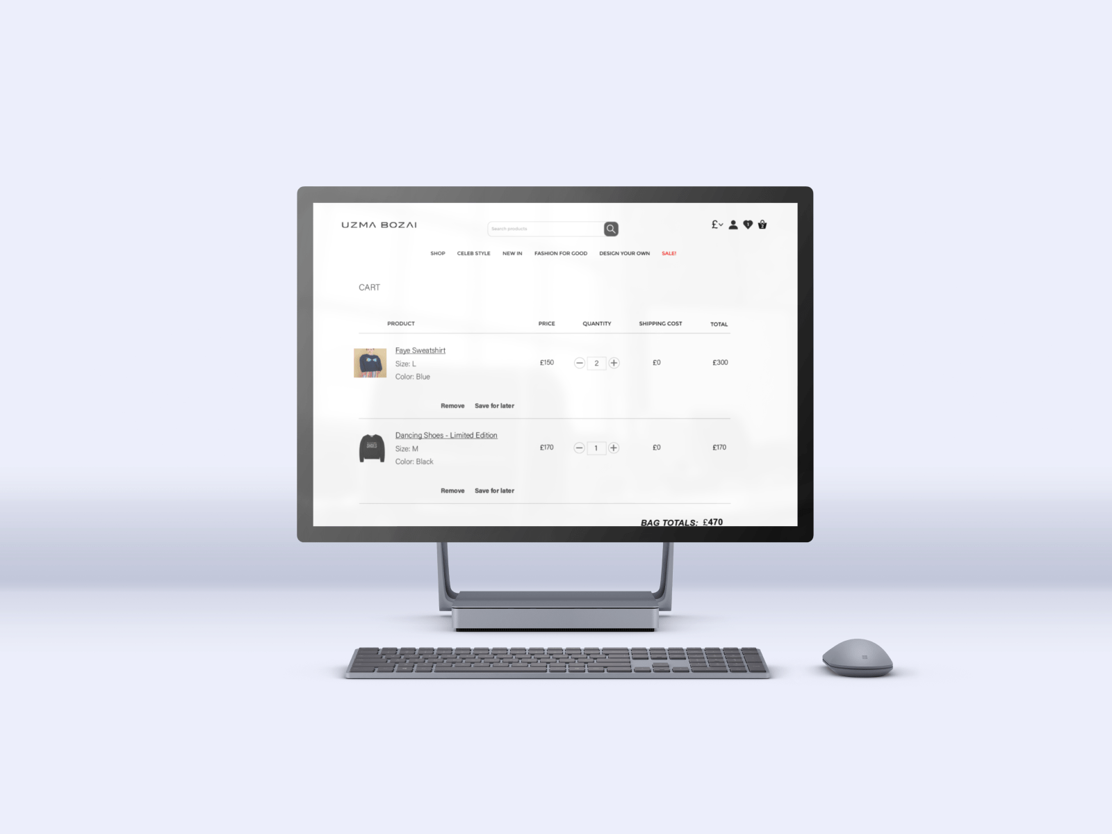
Cart page plays an important role as well. Simple things like coupon code should be very accessible. Even an easy checkout option or modifying the cart plays an important role
Checkout form is one of the most important things to be considered to improve conversions. No unnecessary field should be sitting in there which asks more efforts from users because in no time they would be moving to another platform. Checkout form should also have a progress bar to indicate how many steps more to complete the process as it feels less burden.

A/B eye tracking
A/B eye tracking was conducted as part of the usability testing. From my personal experience I consider eye tracking as one of the best usability practices to clearly understand distraction points in your design and with e-commerce even a small distraction could be misleading and eventually an exit. Some very pleasing results were revealed from performing A/B eye tracking on high-fidelity re-designs some of which are elaborated below.
A testing was done on the existing designs and it was compared to the re-designed version results.
On single shop page the concentration was more towards the product information which was desired. Though other parts of the page were also looked at but as heat maps also show, more attention was being put to the product information and product images (image 1).
I was surprised myself to see output of a prominent feedback notification. Clearly all eyes have moved to the added to cart notification (image 2).
Removing all kinds of distraction even the nav menu, the user stays with the checkout form itself though adding options to contact incase stuck somewhere should also be considered (image 3).
As the progress bar moves forward, the user follows it with full concentration on completing the form itself (image 4).
On the almost last stage of checkout, still concentration is stern (image 5).
- Another checkout form test page (image 6).
Prototype
A walkthrough of the designs through a prototype video
Detailed case study
For more detailed case study including research,literature review, UX process followed, usability results, kindly take a look at the pdf flip book below: