Firm Hatch
Foundations to a right career choice
What you will come across
- Brief intro into the project
- My role & responsibilities (being a super hero :p )
- A walkthrough of the final product
- How is it different to others - Unique Selling Point
- A dig into the project approach - Design Thinking
- Empathize
- Define
- Ideate
- Prototype, test & iterate
- Digital downloadable edition
- A detailed case study flip book
Roles & Responsibilities
I lead the UX/UI design side of the project. Understanding pain points of target users to bring out the best in a very accessible way was the core purpose. Thinking about the growth of the platform was also a major consideration throughout the planning & strategizing phase.
- Website
- UX/UI Development (WordPress)
- Product Design
- Project Management
- Planning & Strategy
About the project
Firm Hatch is a web-based platform highlighting different career field options available to aspiring professionals within the Computer Science domain. Information is available in digital downloadable edition as well.
Challenge
A user typically takes very few secs to judge whether he/she wants to navigate further on a platform. The very first challenge was to portray the right set of impression that firm hatch is not like any other career platform, rather serves a niche purpose.
Secondly, when you have lot of information to display but at the same time you don’t want to compromise with the user experience, that’s where things get challenging.
Making the platform engaging is always your priority.
Key outcome
After performing thorough testing, heuristic evaluation and many iterations, final product was produced. The target users provided really positive feedback about the platform and were very convinced. At the end a five second test was performed, where users confirmed right message was being conveyed through the landing page itself.
Unique Selling Point
“A USP is a summary of features that make your business unique and valuable to your target market.”
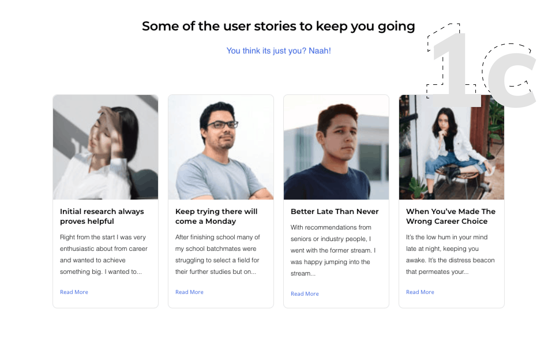
A feature that is unique to this platform and brings in additional value to the product is the user stories. User Stories are basically career journeys of different users that I came across during user interviews and research. User stories are ought to make the platform more engaging and also to act as a motivation point for the target audience. Motivation, if they empathize to the journey and feel it’s their career story.


Design Thinking approach
Design thinking approach was used for the project as it is considered as the user-centred approach that keeps the user at the prime focus throughout the process of the design. I consider design thinking as the backbone of a UX process and is really close to me as a UX professional.
EMPATHIZE
User interviews
As a first step into empathize phase of my design process, I conducted user interviews where 8 participants engaged. The participants were from a wider age range of 18-30 years, 2 of them were in the middle of their bachelors, 3 of them pursuing masters and 3 of them already in their professional careers. The diverse audience was preferred for user interviews to get a better understanding of the career journeys along with finding some common points in their journeys that includes both pain and positive points. The interviews were conducted remotely creating a casual environment.
8/8
All participants felt a lack of knowledge and limited resources were available and had to depend more on connections for guidance.
-/-
On average, participants mentioned they spent 1.30 – 4 hours, 4-5 days a week for about 3-6 weeks.
4/8
4 participants had an interest in computers with very generic knowledge for computers so went with the Computer Science domain.
8/8
8 participants mentioned if allowed to revisit career selection would start off with thorough research exploring all options ahead.
5/8
5 participants also mentioned parental pressure to be a factor for their career selection along with lack of knowledge.
4/8
4 participants are also trying to change career paths to an area of their interest.
3/8
3 participants who had done excessive research before choosing their path felt they had made the right career choice and feel satisfied with their decision though feel would have made much efficient decision if had more resources.
User survey's
To gather quantitative information about the product and the website user surveys were done. A total of 31 people responded to the online survey that was created using google form. 90% of the participants were of the age range of 18-30 years. The aim of the survey was to clearly understand what users usually look into a product revolving around career consulting.
80.6%
What’s your domain of study / work (whichever is latest)?
25 participants were involved in IT-related courses, and 6 participants were from management courses.
64.5%
48.4%
58.1%
When choosing a Bachelor of Study field do you consider future prospects as specialisation, salaries, job market, evolving technologies etc as well?
Prospects, participants consider are important when making a career decision consisted of Job Market (64.5% participants), Salaries (48.4% participants), Career Progressions (58.1% participants), Evolving technologies (48.4% participants), Specialisation fields (41.9% participants). Based on these statistics, the description of each field was formulated with an emphasis on the interest shown by the target audience.
90.3%
What was your medium of research when looking into career options?
When participants were researching potential careers, 90.3% of participants used websites as their medium disregarding physical products.
87.1%
51.6%
What medium would you prefer to access such information (now or in future if below options are made available)?
Though in future, if different sources are provided, 51.6% participants mentioned they would prefer digital newspaper while a higher 87.1% participants would prefer websites and rest small percentages of others.
As a brainstorming activity for a similar improved product, participants when asked for open-ended answers where they could input few lines without limitations
Participants mentioned the product should be simple, easy to use and emphasis should be given on content.
Participants also mentioned advertisements are the most disruptive and they don’t want to see them on the website.
When asked about frustrations or challenges, participants felt the unnecessary need of visiting so many platforms to gather information and considered it a waste of time. They expressed their joy if all information could be found over a single platform.
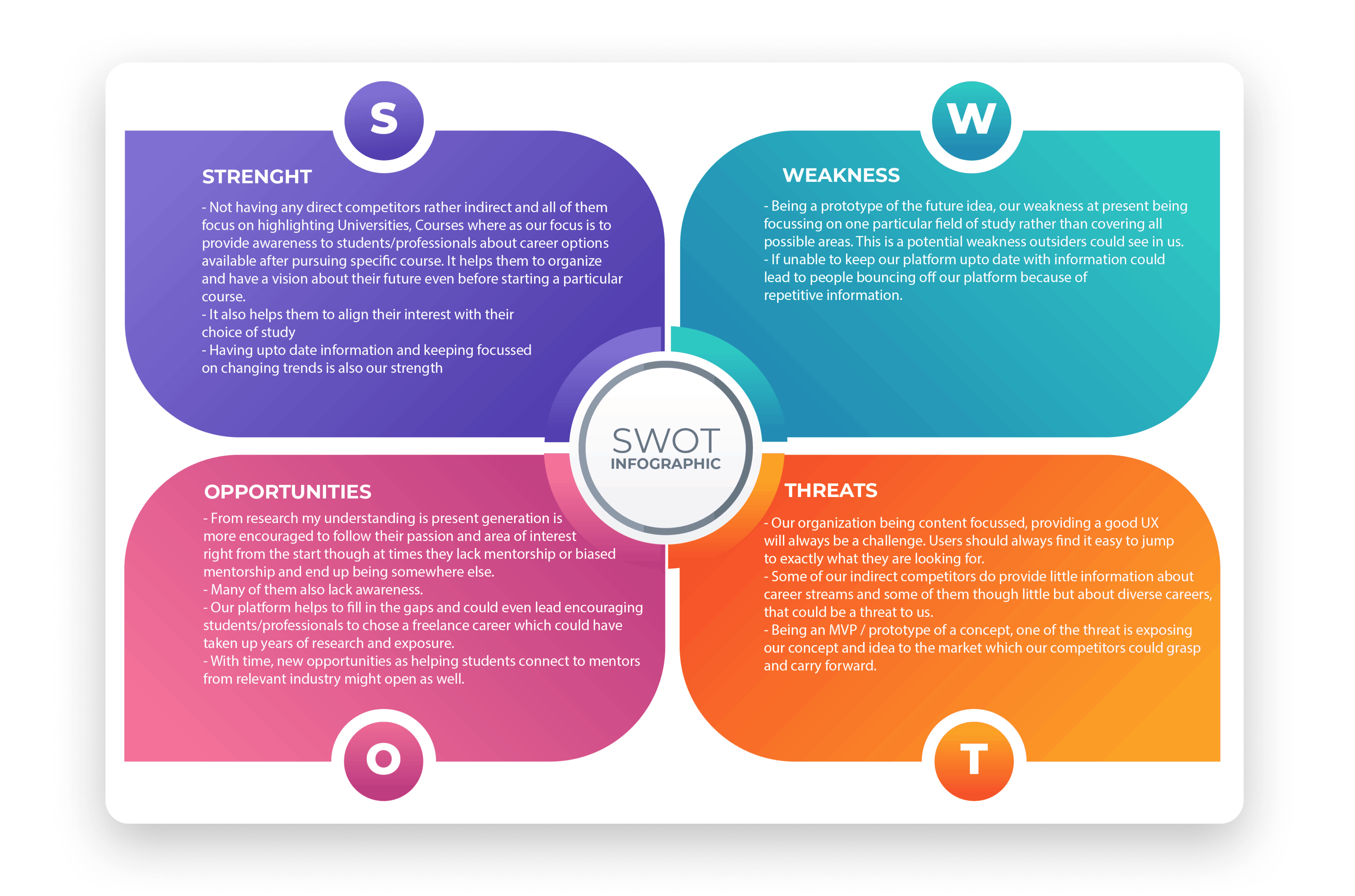
SWOT analysis
After user interviews and user surveys, SWOT analysis was performed in the empathize phase.
Though competitors also show-case information about career fields but in bits and pieces not enough to satisfy end users. Their primary purpose is commonly either a job board platform or a University selection platform where the career-specific information being served on secondary purposes, so very little focus is being put towards it. Due to which the target audience has to keep jumping from plat to platform to gather the right set of information. My product is trying to fill in the gap and caters to the target audience whose primary focus is looking for information related to careers within the Computer Science domain.
Some of the indirect competitors include targetstudy, shiksha, prospects being some of them.
DEFINE
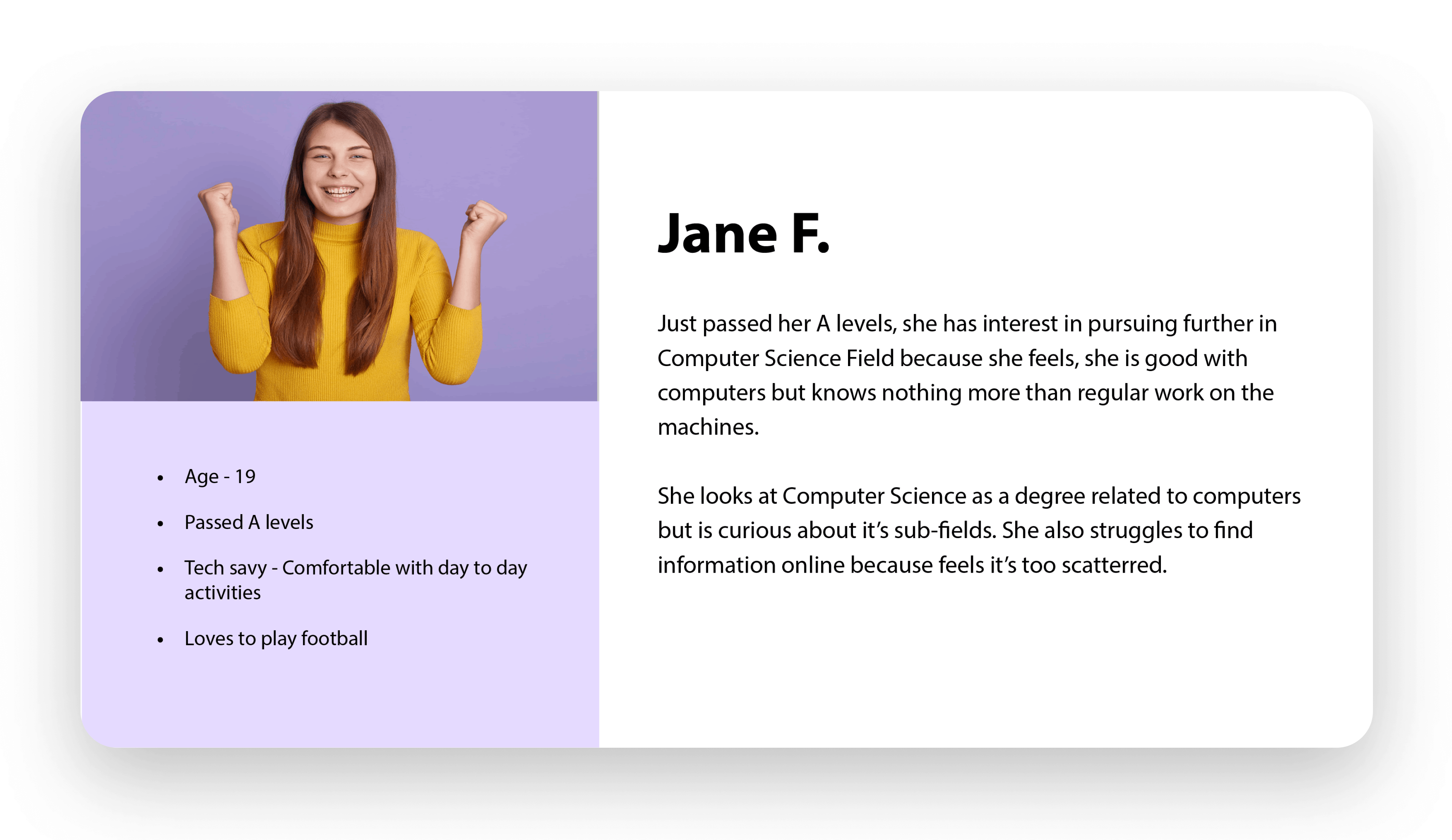
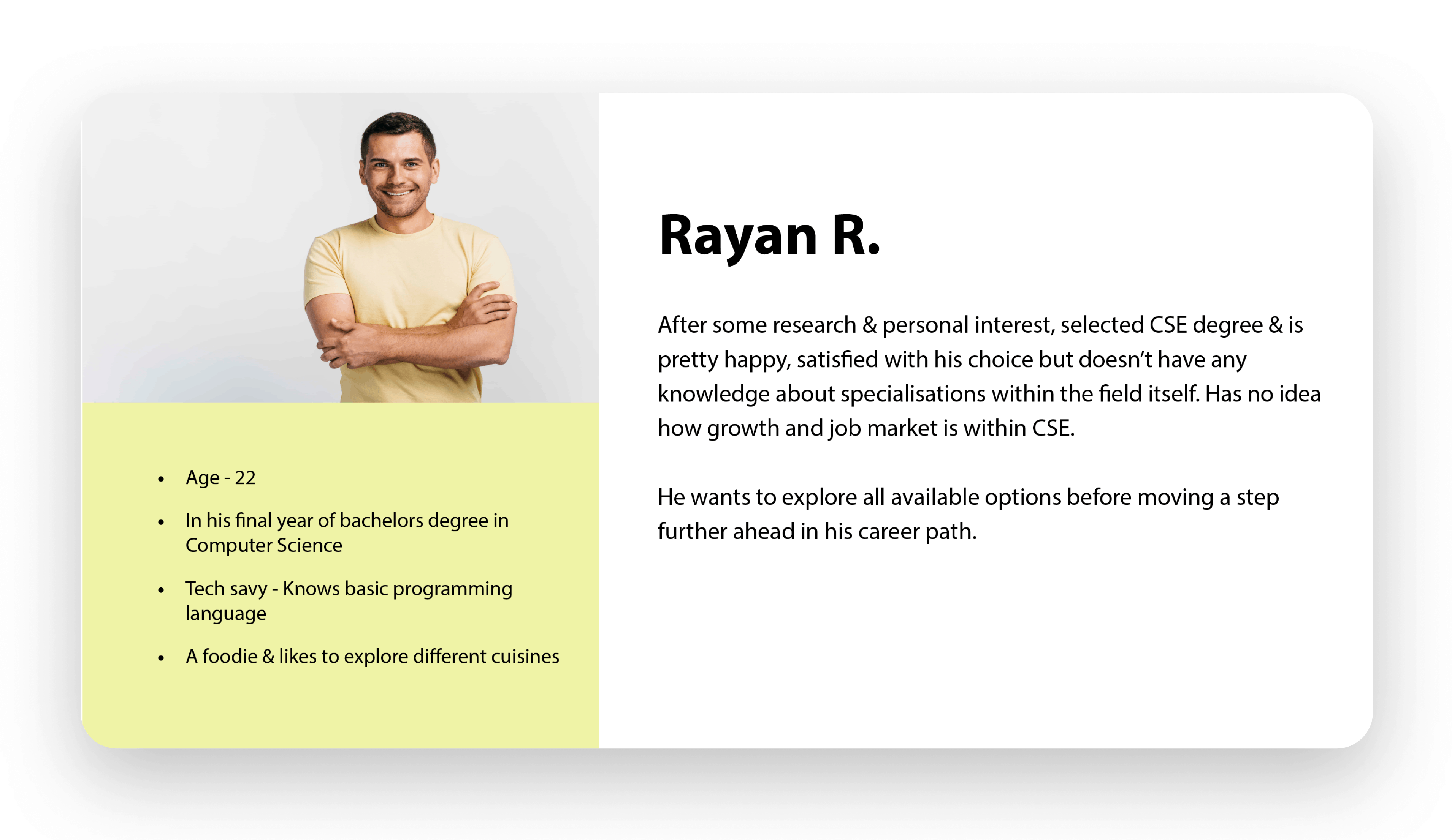
User persona
Primarily 3 personas were considered for my product based on their level of involvement in their professional or education streams. Apart from an initial assumption, user interviews and user surveys helped to develop personas at a much insightful level. The personas were based on pain points highlighted during initial research from the end-users.

Information architecture
With content being the main focus of my product, Information Architecture played a very important part when defining the structure of the website. It helped to differentiate primary with secondary levels and also how to manage its backend when in development phase. Information Architecture also helped to present information in a Hierarchical manner which eventually helped with a better UX of the platform.

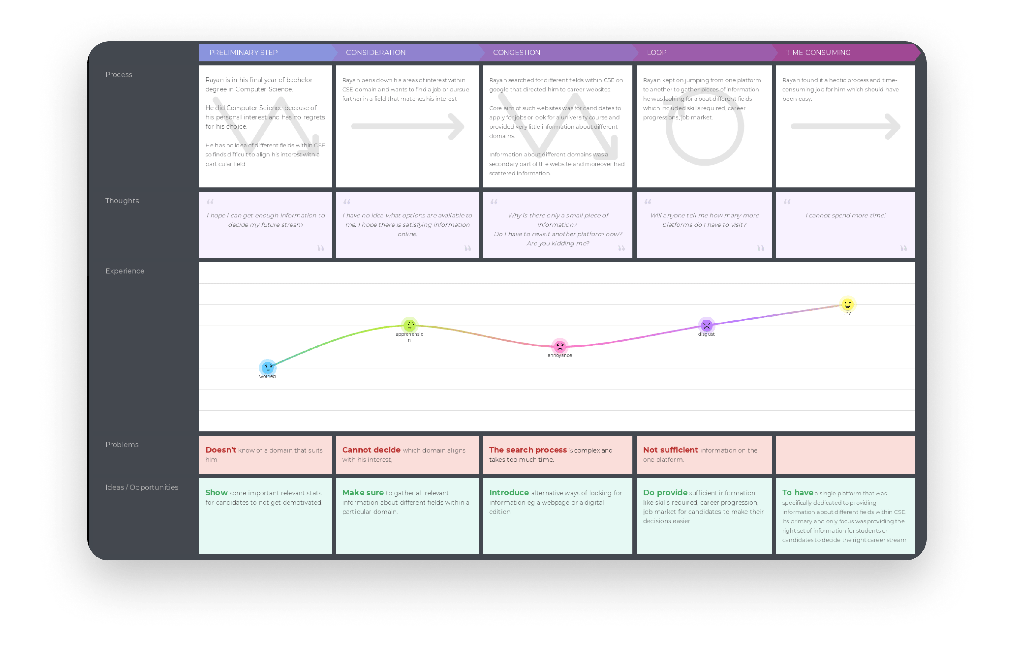
User journey
With all the necessary information, User Journey was the next step into the design process before moving to the ideation phase. User Journey would be the same for all types of personas as all of them eventually narrow down to similar set of information Competitors (Indirect competitors) were also thoroughly examined to understand the User Journeys for career related information. Channels, user goals, process, problems, experience formed part of the user journey map in this case.
(Want to get a clear picture of the UX journey? It’s just a click away :p)
IDEATE
Mind mapping
As a phase into the ideation technique, mind mapping was conducted to put down ideas related to the website.
It being a kind of career counselling website and not a standard career application website, it was essential for end-users to empathize with the platform and to make them feel it serves a different purpose which along brings some more content of its own. Into the ideation phase with lots of organized content in mind, xmind as the software was used for the purpose to put it in the picture for a better understanding. The map included many different sections like content for menu, benefits of the platform, how was the result achieved, CSE fields involved, Insights, tools used, medium in which information is shared and some other.

User flow
User flow was the last phase into the ideation process. User flow helped to decide the flow of the user through the website and how each task would be performed. Mid Fidelity Wireframes were used to make the user flows more intuitive compared to a flow chart. It was aimed to keep the user flow as simple as possible with more than one entry points to a particular task for user convenience and eventually achieve a better user experience.
The three main components of the website being a resource page showcasing different career fields, a digital edition of the same and user stories. Each of these components has its own dedicated page that can be reached through primary navigation and also interlinked CTA’s within inner sections on other pages. A conversion is a contact form. A user at several stages is being intuited to perform the conversion.

PROTOTYPE, TEST & ITERATE
Mid fidelity designs
As a first step into the design phase mid fidelity wireframes were produced after very rough sketches to start with. The mid fidelity wireframes were the result of all the previous phases into the design thinking approach. Final product as already decided being a WordPress website, mid-fi wireframes were done keeping in mind the WordPress development limitations. Because had a lot of content to display, clean layout with minimalist design was preferred over fancy designs and animations.
The 6 main pages includes a Home, About, Resources, Digital Edition, User Stories, Contact.
Home page is to give a taste to the users of what the product is about and provide some important information to get their confidence. It also shows all the career fields that are part of the product with a short snippet of description.
About page is to provide some deeper insights into the product as in how the results were achieved.
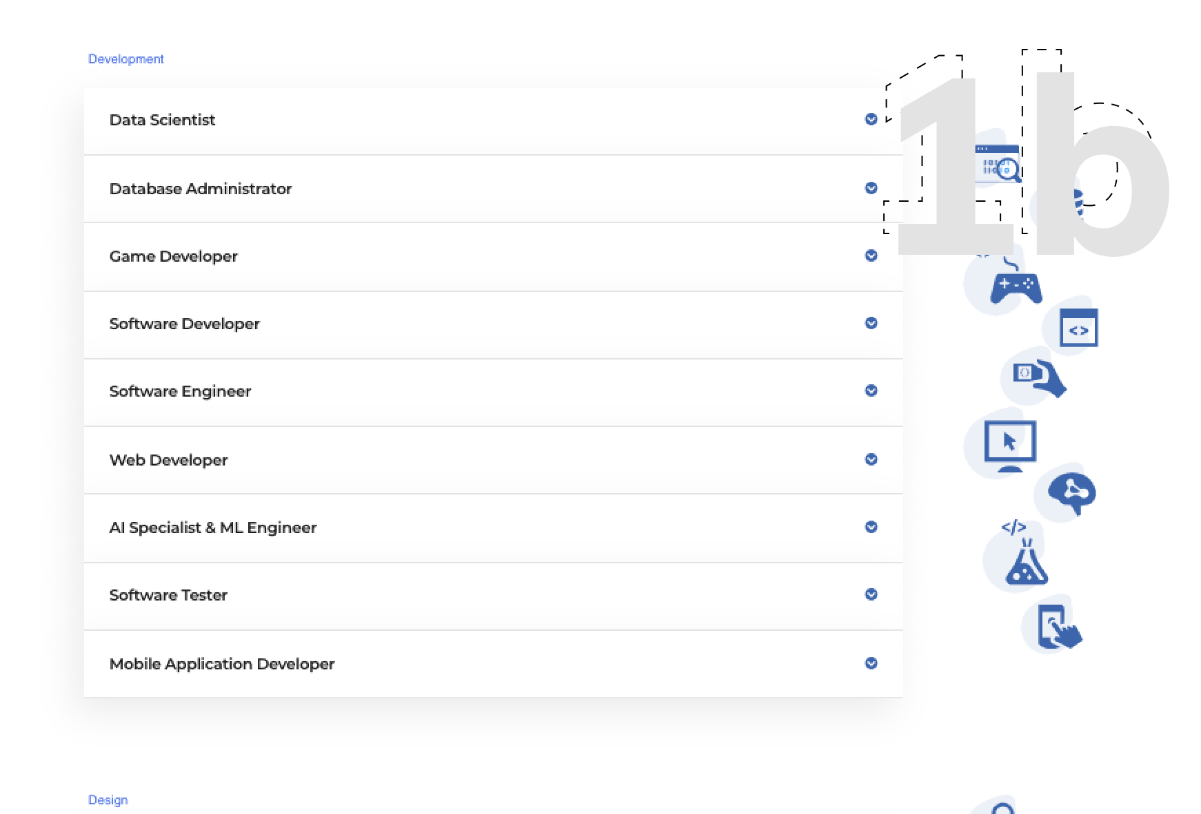
Resources page is one of the three main features of the website. It is the web/online version of the career fields covered with this product. A detailed description about each career field has been taken care of on this page.
Digital Edition page is the second of the three main features of the website. It contains the same information as the resource page but available in a digital downloadable format.
User Stories page being the Unique Selling Point of the product. It shares some career journey stories gathered during an interviews.
Contact page being the conversion page asking users to reach out in case of any suggestions or have their stories to share.

Initial evaluation
Some initial feedback was gathered on the mid-fidelity designs. The feedback was from the target audience after giving them a walk-through of the prototype. From the initial feedback few changes were recommended and to provide further feedback wanted to see a closer replica of the final version to clearly empathize with the product. They felt user flow and user journey in specific had been neatly understood.
Recommendations from the feedback were as under:
- Group the career fields into a proper structure so they can be found very conveniently
- Previously on the resource page itself there are repetitive display of career fields and users felt it as an inconvenient way to display information as it was extra scrolling. Mine reason behind putting it that way was the users should at first come across just the snippets and then can drilldown to the relevant career field
- Users also felt the titles used weren’t so empathetic with the mood of the product and there was a need to put them down in a better way
Final product
Post gathering some feedback on the mid-fi wireframes, the process was moved to high fidelity designs. For hi-fi designs WordPress itself was used because eventually the website had to be developed on WordPress so to make the process much efficient and also keeping in mind the design limitations you come across over WordPress. The thought of process was to develop the hi-fi designs on WordPress post implementing the feedback received after initial evaluation and then keep on evaluating and iterating on WordPress itself to achieve a final product with an improved UX.

Design Rationale
As a UX designer, it’s my priority to give the best, simple, intuitive experience to the users who should always feel in control of the flow. I will give you a walk-through of some of the key design decisions:
Initial Impression
“It only takes a fraction of a second for users to formulate an opinion about a website” 18 so without wasting any milliseconds you have to highlight core values of the product. Following this practice, I introduced the three core features of my website within the second scroll. This part wasn’t a part of the initial designs but from evaluations it came to notice the users were taking some time to really understand the motto behind the website which in real world scenario many users won’t invest rather will bounce off. Also, according to Law of Serial Position Effect “Users have a propensity to best remember the first & last items in a series” so placement does play a very significant role in design.

Resources Brief
This portion is part of the home page to give users a taste of the resources. This section like other sections also evolved, from being scattered all over the place to grouping them in 3 different categories. The three different categories are: development, design & analyst fields. As according to Law of Proximity, “Objects nearer to each other tend to be grouped together” which was taken into consideration. Also, icons relevant icons were also added for users to easily recognize the field. The choice of fields was from research itself though.
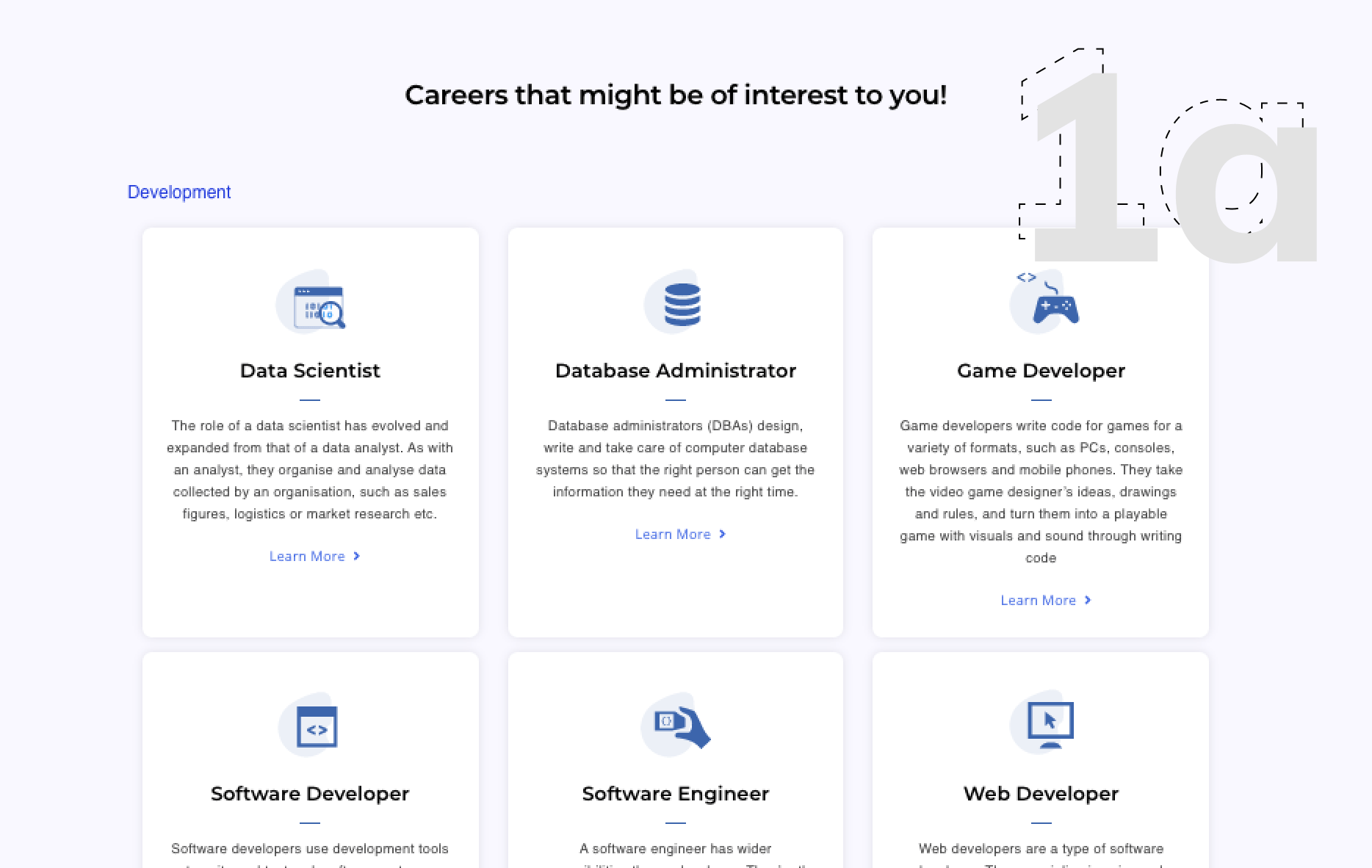
Resource Page
Through user research it was understood what users want in the description but putting them down on paper gathers a lot of content sufficient enough to have a dedication page for each field. Though it is worth considering for future iteration when there isn’t any time limitations and you can work precisely on each page bringing it out beautifully. For this MVP, all the field were put as dropdowns so as to accommodate all fields on one page while keeping the UX user centred. Users with interest to any specific field, drill downs to read further content. Previously in order to achieve minimalist design on the page, two columns layout was considered which was though over after evaluations though according to Teslers Law also known as Law of Conservation of Complexity, “For any system there is a certain amount of complexity which cannot be reduced”.
User Stories
Unique selling point of my product that makes it completely different from other indirect competitors being user stories. According to Jakob’s Law, “Users spend most of their time on other sites. This means that users prefer your site to work the same way as all the other sites they already know” which influenced my design decision for user stories. To mark it unique I didn’t want to make it look very unique rather followed the standard design used for blog posts, so users understand with a hyperlink to could dig into more details.
Digital Edition
Digital Edition page is the second of the three main features of the website. It contains the same information as the resource page but available in a digital downloadable format.
Heuristic Evaluation
After developing the initials designs on WordPress heuristic evaluation was conducted as a usability exercise. Heuristic evaluation was performed by 3 usability experts who are not from my target audience.
The main takeaways from heuristic are as under:

Five second test (final outcome)
According to https://fivesecondtest.com/, “five seconds is long enough for a good design to communicate its primary message”.
After doing iterations from heuristic evaluation, I performed a 5 second test as the final stage into my process. It was performed to overcome “match between system & the real world” heuristic, which I believe holds a very crucial value to the product as users have to very initially realise it is not the standard career browsing website.
It was performed with 5 participants who were part of my target audience.
“The website has populated a lot of data for particular chosen career paths and wants to make people aware of what each of them entails for them”
“It’s nice. Generically informative about different job roles in CS. The website is very neatly done though”
“It’s a great place to start looking and developing interest in different kinds of roles. But almost every job description states “duties include but not restricted to”
“The websites is trying to provide career guidance into computer science field and also has some user stories probably career related”
“Professional guidance, Career paths, career understanding”
Detailed case study
For more detailed case study including research,literature review, UX process followed, usability results, kindly take a look at the pdf flip book below: